.
 
|
|||||
|
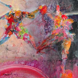
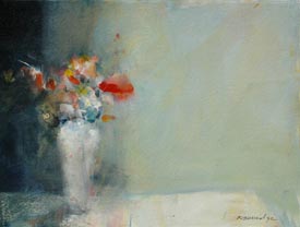
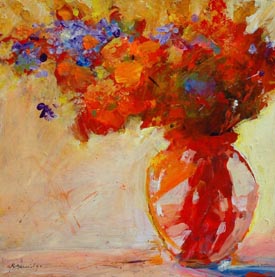
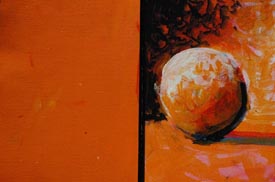
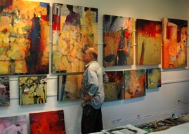
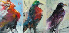
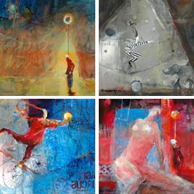
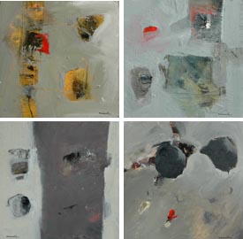
One of the best perks being a painter is... painting. We can choose any medium and go paint with it. I paint all the time and choose any medium to explore and goof around with. I love oil, acrylic and watercolor paints. Specifically, for me, painting in oils is a luxury. I love the lore, the history, the alchemy and of course, the aroma! I’m teaching an oil painting workshop next month at the San Luis Obispo Museum of Art, so my odiferous studio has stacks of wet canvases waiting to dry. This week in the studio has been exhilarating and scary (after all, it’s Halloween!) Oil techniques are a lot different than acrylic techniques. I’m more attentive to mixtures - hoping to get correct mixing ratios and drying accelerators, plus keeping a healthy and safe environment. AND making creative, visual excitement on canvas. Keep the challenges coming, I say! Next issue you will read about my latest and current ongoing theme, using oil as my medium.
I received a truly wonderful gift at my last Studio Mentor Workshop. Robin Walker instigated a secret book project called “Rush of Joy” and invited artists who had been in all of my Studio Mentor Workshops to participate. I was surprised, overcome and very teary! Thank you so much Robin. If you want to take a look, the book is available from www.blurb.com Search for the title "Rush of Joy" and you will be directed to it. It's available at cost in soft or hard cover to anyone who wants it. It's also fully previewable. In December we will post our schedule for my 2011 Studio Mentor Workshops. Stay tuned.
Speaking of gifts, Kate and I were presented with a great tee shirt at a workshop in Colorado. Virginia Witt and Marti Nelson wrote down all of our “clever” sayings during the week on a personally tie-dyed tee shirt. Hysterical! Thanks so much! Bob says, "This is pitifull!". Product Spotlight
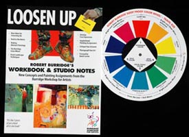
Robert Burridge's Workbook & Studio Notes and Travel Size Color Wheel Workshops in the Spotlight
Trade Show & Workshops Here is Bob’s teaching schedule:
For more of my workshops all over the county, click HERE to check out my workshop schedule. Great Trips! - International Workshops
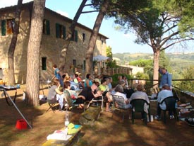
Paint with Bob in the Bahamas Painting in Tuscany!
Seven nights lodging at the villa, nightly genuine Tuscan meals and fine wine are included. The five day workshop will take place Monday through Friday. Contact Sedona Art Center (888) 954-4442 or (928) 282-3809 Product Review Isabey - The Hardest Working Brushes in the Business!
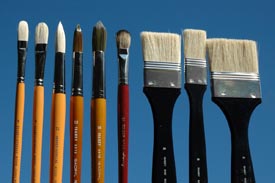
1. Series 6088 Filberts - #12, #8 and #6 These brushes are sold in fine art stores that feature Savoir Faire products. Also, that is where I buy my Fabriano watercolor paper, as well as their Sennelier line of paints. I have been painting for twenty years with these painting products (along with others). Next month, more about why I use Fabriano paper! Studio Tip
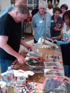
If you have been in my workshops, you experimented with the liquid cleaner Citra Solv I use in my art. It dissolves the printing ink into patterns on the pages of National Geographic magazines. Also - I’ve discovered the pure Castile Soap from the same company for super-cleaning my dead brushes. It’s a natural, all-purpose liquid soap with organic essential oils. It’s more concentrated than Murphys Oil Soap... a little goes a long way. It works! Now you know why my bruised brushes last so long.
Go to Citra Solv’s website to see all their products! Don’t forget to check out their artists’ page with creative projects, online shows and an artists’ gallery.
Another new product I’ve been using as my “drawing ink” or just making marks into my acrylic paintings is Liquitex Professional Acrylic Ink. I draw using a twig dipped into these acrylic inks. They are permanent, extremely fluid (great for stick drawing) and are available in 30 intense colors. My favorite part is after they dry, my liquid acrylic varnish won’t smear the drawing. There are competitive products with these same features, but for this month, I’m using Liquitex Professional Acrylic Ink.
We Want to Hear From You!
From Connie, Calgary, Alberta, Canada: Thanks Connie,
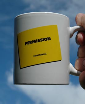
Thanks Connie! For your question on acrylic, water-based varnishing, you get a Permission Mug! New “Must Get” Magazine
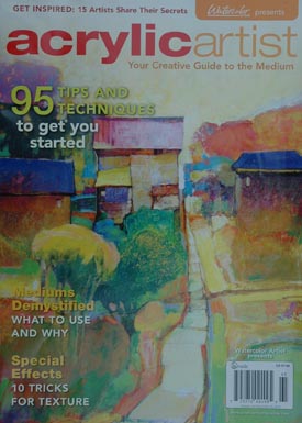
“Acrylic Artist” is a special issue from the folks that bring you The Artists Magazine, Watercolor Artist and The Pastel Journal. Acrylic Artist is their premiere issue they call the “creative guide to the medium.” Indeed it is! Over fifteen different painters demonstrate their “secrets” - and there’s a cool article on those goofy special effects you can only get from acrylics. Find it where you buy your favorite art magazines or download . So if you want to know a lot more about acrylic painting (and I do) get this first edition! Ask Kate about Art Marketing
DOs & DON'Ts
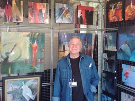
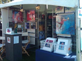
We have been doing art festivals for many years - and I am happy to say that we have ALWAYS experienced something positive from participating: Sales, Commissions, Publicity, New Galleries, Meeting Collectors are the ones that come readily to mind. Festivals can be hard work - setting up the booth, breaking down the booth, talking to potential customers and generally “being on!” Here is a short list of “MUST DO’s” when you are in an art festival or open studio to help sell your work: 1) Greet everyone who enters your space with an upbeat and positive attitude.
Burridge Painting of the Month Club
The paintings are all originals - acrylic on paper or acrylic & combined media on paper. Each painting is completely painted and hand-selected by Robert Burridge, signed and dated. Each month will be a different subject matter, including still lifes, abstract, landscapes, figures, etc. and represents what he is currently working on in his studio. Each month you can expect high quality paint on professional quality watercolor paper. 6x9 inch paintings matted on a 12x16 inch presentation. Bob works in a series for the Painting of the Month Club, so pieces will not be copies - but all similar. $75 monthly for 12 months (regularly $150 each) - shipping is included. If you live in California, sales tax will be charged. Sorry, no returns or special requests. All images are solely owned by Robert Burridge Studio. Interested? Questions? Contact Kate@robertburridge.com
Click HERE for top of page.
|
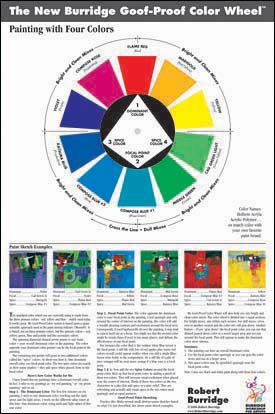
It has been brought to my attention that my Goof Proof Color Wheel has a warm side and a cool side. Hmmm.... something good to know if you want a cool color and a warm color next to each other. Yikes! Too many things to remember! I talk about the importance of recognizing the color values in your painting - but the other important ingredient is determining whether your painting is warm or cool. Make these decisions before you squeeze out your entire line of paint supplies. If you are ambiguous before painting, your painting may be ambiguous as well. Give your work more meaning - more intentions. What this world doesn’t need right now is another “interesting” painting. So, decide on your four colors before squeezing out everything.
Or both? Contrasting values or not? Bottom line - decide what you want. then make it happen! It’s a lot easier for me when I actually use my goof proof color wheel and only four colors. For my Color Comparison Paint Chart of Golden, Lascaux or Nova Colors, click HERE. Oh No! Not the Gray Scale!
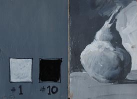
Learn it and here’s why. Did you ever wonder why your painting seems flat and sleepy? It just looks uninteresting? You may look at your painting and say, “I’ve got LOTS of color - so why is it so undramatic?” The answer is: ALL THE SAME VALUE.
All your different colors may be too close to the same value, thus making a “soft” painting effect. For more drama, try values that are far apart from each other NEXT to each other. You know, more contrast: Dark against Light. Like a checker board.
I suggest making a gray scale chart of your colors starting at #10 (full color) all the way down to #0 (no color). Your midtone is #5.
Suggestion: For drama, use more contrast. For soft effect, use less contrast. This information is so important, most “How to Paint” books feature the gray scale in the very beginning. I start each and every painting by spreading a midtone (#5) of the dominant color over the entire painting. I’m halfway finished already! All that’s left to do is put in my darkest darks and the lightest light and the painting is well on its way towards being finished.
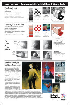
I need a constant reminder about using contrast as a good tool for creating a successful painting! That’s one of the reasons why I created my Rembrandt Style Lighting Chart for your studio. Use it to help create lighting effects, contrast and softness - all with the help of the gray scale. This Studio Chart hangs in my studio next to my work space.
For a detailed description of the Burridge Rembrandt Style Lighting Chart, and how to purchase it click HERE. Recommended Book
And you thought YOU had a bad day in the studio. For most of us, our career would have been finished. But not Close. He continued to paint humongous-sized portraits of his close friends and family. His style and technique was before and still is today to paint “photo realism” (he hated the term) by painting small pixel-type squares of abstract color and designs only inches from his nose. But when you stand back twenty feet, the 10 foot by 15 foot canvas appears exactly like his large format Polaroid® photos that he paints from. Throughout the book there are so many amazing facts that will make you stop for awhile and just reflect about the events you’ve just read... things like his name “Close.” He can only see a few inches away and he has a medical condition that causes him to be unable to recognize faces. Unbelievable. And yet, he only and has always painted close to the canvas - only portraits - only faces from photographs. Today, he can move only just his hands with an attached brush. The canvas moves up and down - he does not move. And, he is painting his best work ever and continues his exhibitions in museums worldwide. Wow! P.S. As an aside, interestingly while Chuck Close was going thru rehabilitation at the New Your City Rusk Institute, in the next room and at the same time was a young industrial designer (me) developing the first custom-contoured wheelchair seat for quadriplegics. Gee, I wish I knew how I could meet and talk with him today! So, if you are interested in what kind of a commitment it takes to be an heroic and risk-taking artist, the true facts are in this favorite artist book of mine. Chuck Close: Life Recommended DVD
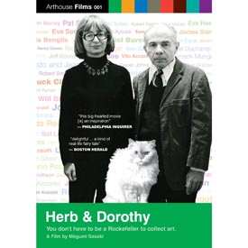
If you are a fan of the early 60s New York art scene, then you already know about Herb and Dorothy Vogel. It’s an exciting documentary of a postal clerk and a librarian who managed to build one of the most important contemporary art collections with very modest means. They devoted all of Herb’s salary to purchase art they liked. The Vogels were truly curatorial visionaries. if you like Warhol, Close and Schnabel-era painters, you must own this DVD. Herb & Dorothy, You don’t have a be a Rockefeller to collect art. A film by Megumi Sasaki Music of the Month More of my favorites! My taste in music goes all over the place! In my studio and during workshops I play many different styles - classical, world, jazz, lounge… This month I wanted to hear some jazz and good electronic beats! Those of you who have been in my workshops probably have heard some of these. Enjoy!
Final Hit: The Greatest Hits
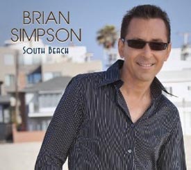
South Beach What is a Goal?
Simply put, a goal is a dream... with a deadline. Daily, I write my goals for the day in my studio. Sort of a... bucket list. It gives me a sense of purpose and a sense of daily accomplishment which I happily cross off at the end of the day. Daily goals. I know, it sounds so 80s. And it works for me and my schedule. Otherwise, I’m in my studio, aimless and just moving paint around. Aimless and ambiguous. Which brings me to - developing a theme.
Every painter whom I admire has two things in common:
Themes that I paint are subjects that are interesting to me. I also paint subjects that are significant events in my life. It’s not about ego - it’s about what I know and I love to talk/paint about it. It’s like these events/occurrences are so memorably exciting to me that I want to “tell everybody.” I do that with paint.
A theme could also be about feelings (happy, sad), a word (hug, alone) or any personal event (such as Van Gogh’s last years in the asylum). Now here’s another point: All themes have been done before... but not by you. A good theme is anything you are excited about. If you are totally wrapping your head around an idea, you have to paint it! It’s your theme. So, do a series - a variation and a variety of your theme! So, how does it come to you? Don’t think it out - write it out. Your theme will magically appear on the written page!
"Inspiration is for amateurs. The rest of us just show up and get to work." -- Chuck Close (click HERE to read the article)  Copyright ©2010 Robert Burridge. All rights reserved.
For Email Marketing you can trust
I’m on Facebook!
Sign in to be my friend. Why, I even Twitter! Recommended FB Fan Pages:
|
||||

