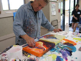
Bob in New Studio
Welcome back...
Well hello again, free subscribers! Isn't this just great? Our monthly newsletter arriving to your computer and you didn't have to remember to do anything until we sent your friendly text message or HTML. If all else fails, you can always go to our website and click on the Newsletter Archives for all the back issues.
Speaking of our website, many of you are placing orders for our products - Thank you! Kate and I are very pleased and appreciative of your response and product orders. We are working on a Studio Chart of my 12 Design Compositions. Look for it in the next few months.
Now, let me clear up a frequently asked question concerning my popular Goof-Proof Color Wheel. As I mentioned, in the product description and instructions, the colors on my Color Wheel match the Holbein Acryla acrylic paints. The colors are also universal colors with universal names like "red," "blue," "orange," etc. So if you do not have EXACTLY my recommended color red, please substitute my red with your red that is a close match. This Color Wheel is not, I repeat - is not meant to be scientific. Exactness is not necessary to make my Color Wheel work. Close enough is good enough for me! It's not rocket science - it's art... so get in there and start painting!
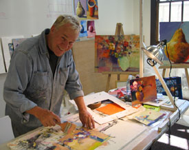
Product Spotlight - Permission Mug
To order click HERE!
Have Coffee with Bob and get all the Permission you need!
White Porcelain cup with Yellow Permission Slip on front
"Burridge Workshop for Artists" logo on back.
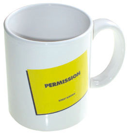
The History of my Artist Permission Slip
Years ago, while attempting to encourage my workshop painters to paint the way THEY have always wanted to paint, I recalled a trivial little protocol while attending parochial grade school. (oh those poor nuns!) If I wanted to do anything not on my normal schedule, such as visiting the library or leaving class early for band practice, I had to get a "permission slip" from the Sister Superior. Go ahead think what you will, but it kept me in line-sort of!
The permission slip in my hand allowed me the freedom and power to roam anywhere.
So I came up with an idea for artists: They too, need a permission slip. PERMISSION TO PAINT THE WAY THEY HAVE ALWAYS WANTED TO PAINT.
Permission Slip
In my workshops I hand every painter their own Permission Slip. It's just a yellow piece of paper with "Permission" printed on it. It's a goofy idea, but transforms the trembling artist into a powerful "can do" painter. Put one in your hands and hang in your studio as a constant reminder to paint the way you have always wanted to paint! I'm not responsible for what happens next. 
For info on ordering go to:
www.robertburridge.com/Products
Workshops in the Spotlight
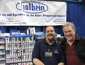
Bob & Dave at "Boone in June"
June has been a very busy month! I was at the Mendocino Art Center in northern California, then to Boone, North Carolina for Cheap Joe's Boone in June Tradeshow and Workshop. We met up with Dave Morency of HK Holbein in the Trade Show Booth. These Trade Shows are terrific places to learn new techniques and buy your art supplies at a big discount! After my three half-day workshops, the Holbein Booth was hopping with sales of Acryla, Mat Acrylic and Rutland brushes.
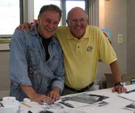
Bob & Joe Miller
Joe Miller welcomed me with open arms to Cheap Joe's beautiful Workshop Room in Boone, North Carolina this month. The week long "Loosen Up & Paint Like Crazy!" Workshop was filled with twenty painters -- from around the area including Florida, South Carolina and as far away as California. Joe and his staff's hospitality are legend. The best part of his workshop is running next door to the retail outlet and stocking up on art supplies at fantastic "Cheap Joe" prices. I felt like a kid in a candy store!
Product Review - Joe's Gesso!
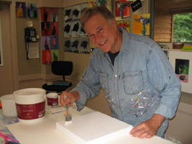
Bob using Joe's Gesso.
Okay, you know that I gesso all my watercolor paper and let dry before acrylic painting. The acrylic gesso primer dries hard and cancels out the beautiful characteristics of the watercolor paper. I prefer this hardened acrylic surface so that I can have a longer working time and move paint around. The paint does not soak into the paper if it is gessoed. The paint sits on top and allows me to scrape, push and move the desired colors around, or to easily wipe away in a reductive technique. Besides, by spreading or brushing on gesso, I don't rely on the absorbent qualities of the paper to tell me what to do. The paper now knows that I'm the Boss!
For years, I've used thick gesso so I can create texture and haphazard patterns on my paper or canvas. Many gessoes today are too creamy or too thin for my purpose. This month, however I discovered a brand new gesso that works PERFECTLY for me. It's the Joe Miller Signature Series One Coat Gesso (red label). It's cheap and it works really, really great for me. One coat brushed or troweled on takes minutes and I'm ready to paint much sooner than before. It's a new product and it's the best gesso for me. www.cheapjoes.com
Recommended Book
"Pictures of Nothing - Abstract Art Since Pollock" by Kirk Varnedoe (ISBN-13: 978-0-691-12678-4) published by Princeton University Press, 2006.
The eminent art historian, Kirk Varnedoe (1946-2003), the former chief curator of painting and sculptor at the Museum of Modern Art, wrote this intelligent and absorbing argument on the value of nonrepresentational art produced in the last fifty years. This book is his final lecture at the National Gallery of Art in Washington, DC in 2003, just months before his death from cancer. For me, he was the most scholarly, most brilliant and most passionate authority on the subject. I am absorbing everything this man has written. For more on Kirk Varnedoe, check out this link to Wikipedia, the free encyclopedia: www.en.wikipedia.org
Ask Kate about Art Marketing
|
ASK KATE! Every month, Kate will post your questions and her responses on the subject of marketing, sales, and promotion. If your question is selected for the newsletter, you will receive a Burridge Permission Mug. If you have a burning question that you would like to have answered -- for your benefit and everyone else's -- email Kate at kate@robertburridge.com
|
Beth Summers of Porter Ranch, California asks:
How does an artist determine prices for original works?
Kate--
As an artist, it's difficult to put a value on to your creative process.
First of all, you've got to ask yourself - do you want to sell your art? If yes, follow these steps:
1. Divorce yourself from your creation - You cannot put a price on your "children."
2. Look at your art in the cold commercial light.
3. Look at your art next to all the others.
4. How does your art compare?
Do you think your artwork is something someone will want to buy? If yes, now do your research: Go to outdoor art festivals, galleries, co-op galleries, etc and look at what's selling... actually selling and not just sitting on the walls! Is your work as good as what's selling? Compare yourself to those artists with your education, experience, clientele and "history in the art business." Where do you fit in? If you're brand new, you obviously can't sell your artwork for the same price as an artist who is very well known.
Establish a sensible price structure that is compatible with your experience. We suggest to start with lower prices rather than high ones - you can always raise your prices as you gain notoriety and develop a growing client base.
Determine what size painting you consider your "signature size." For instance, if you like painting on full sheets of watercolor paper, establish this size as your "starting point." All other sizes are determined mathematically from that size. Your work is sold by the square-inch, just like carpeting. It makes no difference how much you love it or how long you worked on it! A full sheet might be $1,000 (unframed, unmatted - just the painting) so what does a half-sheet sell for? $500. What about a quarter-sheet? $250. Makes sense! It's as simple as that. Having a standard Price List is a real confidence-booster! You will never again have to hem and haw over what to charge a customer!
Tanya F. Dischler from Louisiana asks:
My question is how do you price canvas as opposed to paper? And do you have a formula for pricing giclees as well?
Kate--
I have two separate pricing structures. One for "Works on paper" and one for "Works on canvas" -- There is approx. 20% difference between the two. Both are for acrylic paint. For instance, if a 23x30 inch acrylic on paper is priced at $2500, a 24x30 inch acrylic on museum-wrap canvas can be priced at $3300. Oil on canvas has the highest "perceived value" while watercolor on paper has the "lowest perceived value."
We don't make this stuff up -- the price is market-driven.
For our Gicles - Retail prices for giclees are approx. 10%-25% of originals the same size. Our "Party Animal" gicle print on canvas retails for $200 - the print size is 11x14 inches. An original painting the same size on canvas is $800.
Doing the math makes pricing so much easier!
For more info, click HERE to check out our Hot Art Marketing Workbook.
Thanks for asking Kate!

"Kate - Your Art Marketing Girl!"
Click HERE for top of page.
|
|
 |
The Composition of the Month
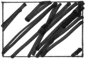
Black & White Sketch
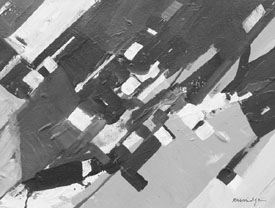
Black & White Diagonal Composition
Diagonal Design. This is one of the twelve graphic designs artists choose as a design structure throughout their painting. The painting will always hold together, no matter how loose or abstract it is - as long as the design of the painting stays within the integrity of a diagonal design. Out of integrity, the painting will fall apart. So, for me, the first major brush strokes are all various diagonal strokes. After that, it's all play and experimentation. Why diagonal design? It's a slippery feeling of moving left to right or right to left in upward fashion to create movement or action in your painting. It's certainly not a stagnant or boring design.
Finished Diagonal Compositions:
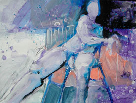
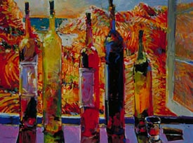
Male Nude
23x30 inches
acrylic on paper
Hand in Hand
16x20 inches
acrylic on canvas
Canyon Treeline
18x14 inches
acrylic on canvas
Something New for Bob
Viva towels - For Painting & Texture
Bob Paints with VIVA Towels
I am often asked why I paint with Viva Towels along with brushes in my workshops and studio. For years, I have used a variety of goofy brushes and large sponges to keep that wet and juicy look in my work. Paper towels were used to wipe in large areas of color or to wipe away layers of wet colors in my reductive painting technique. Besides, paper towels are an invaluable studio tool when experimenting. In my heavy-handed painting style, ordinary paper towels always fell apart and left small piles of unwelcomed paper pulp in the painting! Viva Towels do not fall apart. They are soft to the touch and act like baby diapers. When I wring them out, I can reuse them - plus, after the used towels dry, they look like tie-dyed fabric so I also use them in my collage paintings. Clever, eh?
Viva towels are pattern-less, soft, clean and simple. Make sure you get the plain white ones - no cute patterns, little running duckies or stupid flowers!
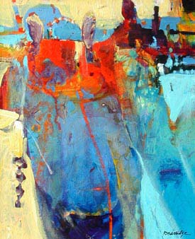
Patterns and Repetition of Shapes
We have all read that a successful work of art utilizes some sort of common pattern design (like no running duckies or stupid flowers) all over. Pattern designs come in many shapes and disguises. Some are obvious and some are more subtle. Obvious ones are... well, obvious like a checkerboard design. Subtle ones could appear as a repeated brush stroke direction - left, right, left, right or up, down, up, down, or crosshatch, etc. Specific color combinations repeated throughout the painting is another form of subtle pattern.
Checkerboard Patterns:
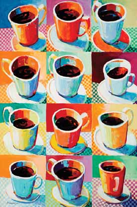
Twelve Cups
40x60 inches
acrylic on canvas
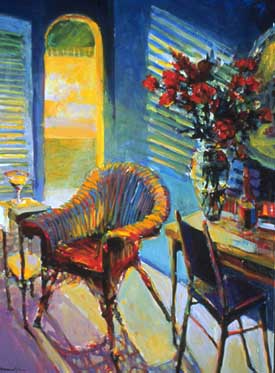
Window Light
23x30 inches
acrylic on paper
Also we have found that repeating a specific shape around the painting helps to hold and tie the painting together. This is helpful when you find your painting falling apart or becoming visually fragmented. Try it. When your painting feels like it's just not coming together visually, try repeating a specific pattern all around in spots and/or try repeating a color combination all around in specific areas.
Repetition of Shapes:
We Meet Again
30x40 inches
acrylic on cnvas
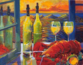
By the Beautiful Sea
36x48 inches
acrylic on canvas
Patterns and repetitive shapes lend themselves to familiarity, comfort and recognizable objects. It is up to the artist to make it work in a not-too-obvious fashion. This concept has worked throughout history in architecture, painting - even in theatre and literature. It's just one more thing to play with during your art-making journey!
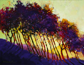
Repetition of Shadows and Brush Strokes:
Visual Feast
24x30 inches
acrylic on canva
Maui Martini
30x40 inches
acrylic on canvas
Bob-ism of the Month!
Authentic creative expression comes from your attention and your intentions.
Action overcomes fear.
Show up in your studio and just start!
Take the first step by jumping in. It reduces self-doubt.
If you think too much, you will paralyze yourself into not painting.
Decide on what's important today in your studio... and go do it first!
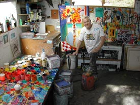
Bob in Studio
Copyright ©2007 Robert Burridge. All rights reserved.
If you wish to copy this material to other publications or mail lists, please ask for permission by contacting:
Robert Burridge Studio
Arroyo Grande, California
805-459-1503
rburridge@robertburridge.com
www.robertburridge.com
Click HERE to sign up for the ArtsyFartsy News.
|
|