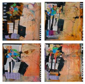
.
 
|
|||||
A lot has happened since our last ArtsyFartsy Newsletter! I will attempt to squeeze some of it in this newsletter.
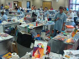
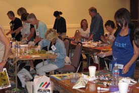
My travels have taken me all over the United States! Kate and I were in Dallas for a 5 day painting workshop, evening demo and another art marketing demo. What a professional group - we had a great time.
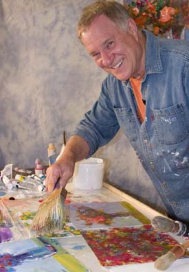
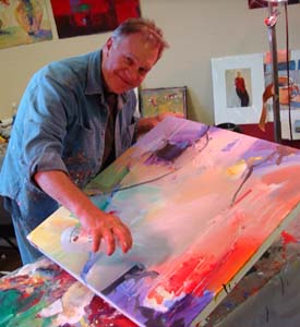
It was “Boone in June” for me - I was at Cheap Joe’s for a week-long workshop, a demo and a 1 day Workshop for the High Country Watermedia Society, 3 days of Cheap Joe’s Blue Ridge Art Sampler and Mini Workshops. I filmed a new DVD - “Abstract Florals from Colorful, Loose Splatters” and Kate and I even managed to film an Art Marketing DVD. Look for those soon!
I was honored to do a workshop in the Hudson River Valley in May. Everything was perfect - the weather, the accommodations, the food and the workshop hosts. I’ll be returning to teach there again in 2011.
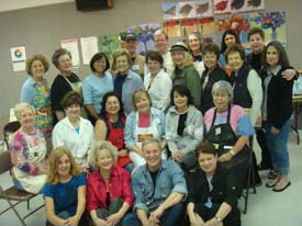
Thank you, Jennifer Stone for hosting and coordinating another very successful workshop in Watertown, South Dakota. Hospitality and new found friends were a great experience for me. I’ll be posting fun photos from this workshop on my website.
My first time to Traverse City, Michigan - an extremely charming and “Americana” town. Exceptional Art Center was well organized with a very energized staff - multiple art events happening all at the same time. I had the opportunity to take some side trips and experienced outstanding wineries, local galleries and great food. I’ll be back in 2011.
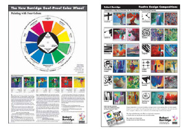
I also participated in my home town annual event - The Central Coast Wine Classic. This year, my featured artist gig was painting a wine barrel. Product Spotlight Imagine painting your next powerful masterpiece with both of these studio charts nearby. Helpful if you get off track and need to refocus your color, your composition and your original intention. And they are both made in the USA. Set of two Studio Charts - $29.95 plus shipping/handling (CA sales tax) Click HERE for info on ordering. New Solo Show
August 24 - September 18, 2009
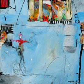
We have BobArt Notecards featuring No Full Disclosure paintings! A pack of 12 notecards and envelopes, 2 of each painting and blank inside. $17.95 + shipping/handling. For info on ordering, click HERE. Trade Shows Coming Up!
There are many trade shows and conventions for workshops and art materials all over the country! Why should you go? Here’s a few reasons: Our East Coast Trade Show is Art of the Carolinas sponsored by Jerry’s Artarama in Raleigh, November 12-15, 2009. Click HERE to order your workshop early!
Product Review
My latest paintings include paper collage materials, as well as acrylic paint. My technique of handling papers, cardboard and gel medium is much more than a “light-touch.” I use an action-filled, heavy handed approach when I push around stuff on the surface. Ordinary stretched canvas won’t withstand my barrage of creative energy. I have been using Cheap Joe’s Prime Really Good Cradled Painting Panels - extra deep.
These good looking panels are 1.5 inches deep and are available in twenty-two sizes. They are not top of the line, hardwood artist panels, but they are “Really Good.” The best part, as Joe says, “They’re Cheap!” ...And they are perfect for my work.
Ask Kate about Art Marketing
Judy from Edgewater, FL asks: I have been working on a new portfolio. I always work in a series, (usually 12 or more) and thus, I have a few series that I would like to showcase. My question is this: To get into a gallery, (checked out for "fit") do I send 2 or 3 from EACH series... or just showcase one at a time? Secondly, I sculpt and enjoy exhibiting my sculptures along with my paintings. What do I do with these? In a nutshell, I love doing a variety of paintings (think Bobland, e.g. human form, fruit, abstract etc.). I don't know the best way to market this work? Help!!! Dear Judy, Great question! So glad you work in a series, as it is so much easier to market your work when you send out a strong style and theme message. Generally we do not send out more than one “theme” or series to a gallery unless the style is very similar - like Bob’s Wingland series and his Roadside Attractions Circus series. If your series are vastly different, like Landscapes and Nudes, it might be confusing. So, to get back to your first question I would send no more that two related series subjects - probably ten images each. Your second question about exhibiting your sculptures along with your paintings - I think it’s great as long as they complement each other. There is a gallery in Blowing Rock, NC that we enjoy visiting and there is an artist who does the most beautiful pear paintings and pear ceramics. They look great together! Having the 2-D and 3-D exhibit capabilities can be a super marketing tool! Make sure they are good partners and you can really promote a great story. Thanks for your email and I hope this helps. Christina from San Luis Obispo, CA asks: The Special Collections Dept. of a University is interested in purchasing a work of mine. They asked me to submit a "prospectus". Of course I said, "Sure, I'll get that right to you." But now my problem is, what is a "prospectus" and how does it differ from an artist's statement? They only specified that I needed to include the price of the work. Dear Christina, Oh you gotta love those universities! You're right - It's basically your Statement concerning the piece, plus materials, techniques used - that sort of thing. Include a high quality photo of the artwork, just in case your packet of information travels thru a department. Everyone involved in the decision-making would need a visual to go with your words. Computer print is fine - make sure you use photographic paper and that the color matches the actual art. I would also add info if your artwork was a part of a larger series (if it was a part of a show, body of work, etc.) and the provenance - where it has been exhibited. Then round out the promotional information with you short bio and the price of the art. You are using this prospectus to actually sell the merits of the artwork to others - a committee, the head of acquisitions, etc. Make the overall prospectus look valuable. Thanks so much for your question - hope you get the sale! Breaking News! AND... Bob and Kate are very involved in the International Society of Acrylic Painters. Bob is the Honorary President and Kate helps with their marketing. Therefore - ISAP’s 2nd Online International Open Exhibition deadline is September 15. Juror is Maxine Masterfield. Click here for more information. For more info, click HERE to check out our Hot Art Marketing Workbook.
Thank you all for your well wishes, your support and very kind words through my difficult time. Sure makes me appreciate everyday. After a few miserable months, we adopted Charlie (orange tabby) and Tootsie (muted calico) from our local shelter. We both have been laughing a lot!
Click HERE for top of page. |
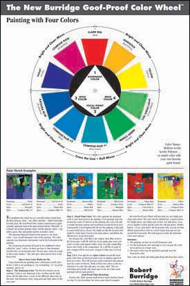
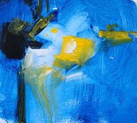
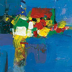
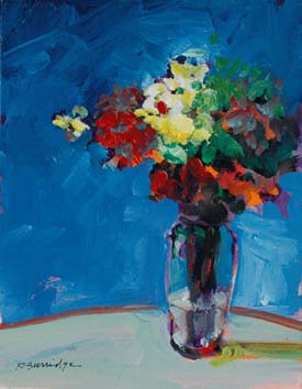
This section is my continuing series, featuring successful color combinations using my Goof-Proof Color Wheel. (Shameless!) This month’s dominant color is Holbein’s Katsura Blue (you can substitute a dark Ultramarine). Using the Burridge Goof Proof Color Wheel and your matching paints, try a series of small abstracts practicing this month’s color combo. Decide on a Composition and Dominant Color. •Katsura Blue is the Dominant color
Step One: Cover the entire canvas or paper with Katsura Blue plus white and black. For me, I treat each “layer” as practicing abstracts. At this point the painting is basically monochromatic.
Step Two: I place the focal point color - Yellow - right where I want the eye to go. I do this whether or not it is an abstract or representational painting. I’ll also use this focal point color elsewhere in the painting, only grayed down. It helps to keep this limited palette color combo related.
Step Three: When dried, I loosely brush in the two spice colors (Flame Red and Middle Green) around the focal point color (Yellow). I have the option of also graying down these two spice colors and using them in other areas.
For a detailed description of the Burridge Goof Proof Color Wheel, click here. Studio Tip
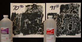
Most watermedia artists have seen the mystifying effect when ordinary rubbing alcohol (isopropyl alcohol) is sprinkled on a wet watercolor painting. The effect is a pattern of circles and dots, like an explosion of white flowers. Try this yourself - Using a large brush loaded with wet, juicy watercolor, quickly brush the watercolor paper. Next, while it’s still wet, sprinkle (put your thumb over the opening so you can control the amount - you are sprinkling, not pouring) the alcohol over the surface and see what happens. If nothing changes, the paint was either too dry or too thick - or too wet. Try different strengths of alcohol for different effects.
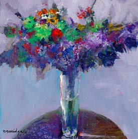
When dried, the result is a wonderfully new creative surface to begin on. I begin many of my floral paintings this way.
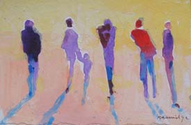
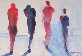
You probably already know this, so this is just a reminder. Include human images to your plein aire scenes to help indicate scale. Do not be concerned with any detail - just a “carrot shape,” which is a vertical stripe, wider at the top and narrower at the bottom. You paint “carrots” in animated shapes. Surprisingly this visually translates as “people” in the landscape. Practice painting loose carrot shapes in various colors and voilá … you have the illusion of the human figure in your painting.
Paint figures freely and loosely to suggest movements. Practice these and fill an entire page in your sketchbook with lots of small thumbnails of carrots (see sketches). Add shadows to the carrot images - it helps to anchor the carrot to the land and suggests a light source direction.
Now here is an amazing painting trick. To make your figures appear walking TOWARDS you, you only need to not connect the circle (head) to the carrot (body). See sketch. And to make your figures appear walking AWAY from you, connect the circle (head) to the carrot (body). It’s all goofy stuff, but the illusion is convincing! Practice this technique with a loaded brush of loose, juicy wet color. Hope this helps. Recommended Book
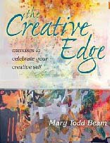
You all know Mary Todd Beam and you have her books! Your own art has improved since reading her influential ideas and techniques, nurturing creative process and artistic expression. I am highly honored to be a contributing artist in this book - The Creative Edge, a follow-up to “Celebrate Your Creative Self.” Most likely, you will add this book to your collection - read it! And do the exercises too! Charming, beautifully designed, and the book lays flat. Like her previous book, this one has a spiral binding under the hard cover - very easy to do the follow along demos that take you through twenty-five techniques that will definitely jump start your next masterpiece. Add both books to your library - if you want to go to the next level. The Creative Edge: Exercises to Celebrate your Creative Self 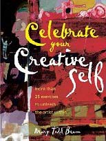 Celebrate Your Creative Self Music to Paint (and Move!) By
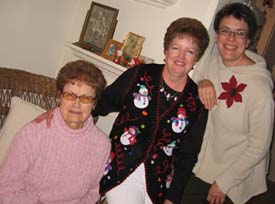
More music! My taste in music is rather eclectic. In my studio and during workshops I play many different styles - classical, world, jazz, lounge… Love Opera? But don’t understand the words? Love Puccini and Mozart? Do you find yourself humming along because of how beautiful arias are? Then you’ll love these two CDs. Play them while you paint and you’ll find yourself in a very uplifted spirit to create and paint better. 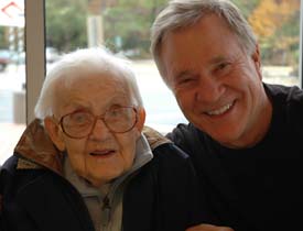 Bob and his Mother, Josephine Goguen Burridge (1910-2008) 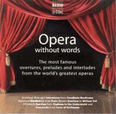 Opera Without Words 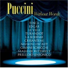 Puccini Without Words
For even more music, click HERE and it will take you to my complete, favorite Workshop Music. We will post more favorites and new finds every month in our ArtsyFartsy News and on my website. We’ve separated them into categories to make it easier. Enjoy! •Under every great painting is a great abstract painting!
Copyright ©2009 Robert Burridge. All rights reserved. Click HERE to sign up for the ArtsyFartsy News.
I have Facebook and MySpace pages set up! |
||||
