
Hey Folks!...
Welcome back this month for another "WHOOHA" through our free online newsletter. And as our masthead touts, we don't take all this too seriously except the shared belief that we all got something to show! --and we have something to say! --and paintings to paint!
We don't have time to read this whooha-- better you spend the next few minutes painting. You will learn a great deal more by actually making a painting, rather than reading my quips. But, when you're finished painting, read this newsletter. I talk about why I do lots of daily warmups (Click HERE to view my latest Circus Portraits for sale on our website!)

Small Original Paintings
Clown 18

Small Original Paintings
Pole Dancer 12
If you read about it last month, you know I had the extreme honor to jury the Emerald Art Center's National Spring Show in Eugene, Oregon. I flew there in late April to select the award winners - a real treat to see the actual paintings. I also did a demo and lecture for their monthly meeting. I know what you're thinking... and I've been warned before... never ever go before a group of artists you've just juried and do a live demo!

Bob and Gladys Bacon Rust,
Exhibit Chair
Well, let me tell you, I was smitten with Eugene. The people were charming, polite and talented. Gladys Bacon Rust, the Show Chair, was a dream to work with. I enjoyed my stay there and was treated like a king. Emerald Art Center is a class-act organization and a first-rate art center. By the way, I'm teaching a workshop there next January! (shameless)

Black Gold
Usually my work is all about color. Lately, however, I have been working in black and white, rediscovering its monochromatic beauty. When I was invited to participate in a group exhibit in Santa Barbara, California at the Fielding Graduate University, I was so ready to show my latest black and white series.
These black and white paintings represent my latest series based on letters of the alphabet. I think type is a beautiful and powerful design element. I have always loved typography, especially foreign and exotic type. Mysterious, magical scribblings communicate everything you need to know. To see all nine of my new black and white paintings, click HERE. 

Letter C #3, #4, #5, #6
12x12 inches
combined media on canvas
Product Spotlight

Loosen Up with Acrylics DVD
Robert Burridge's Loosen Up with Acrylics DVD
Burridge shows you his personal techniques to successful acrylic compositions. Joe Miller of Cheap Joe's writes: "He is constantly moving, painting - talking and you can't help but have fun watching and learning from all the great things that he has to say! Watching Bob paint is a lot of fun - learning from him is even better!"
Available on our website or in Cheap Joe's catalog. This DVD was produced by Cheap Joe's Art Stuff and filmed in a TV studio in North Carolina. It's great for beginners and explains why I start off with an orange-colored background.
67 minute DVD
$35.95 + shipping & handling + sales tax (CA residents)
For info on ordering go to:
www.robertburridge.com/Products
Workshops in the Spotlight
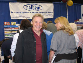
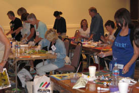
Trade Shows are coming up!
There are many trade shows and conventions for workshops and art materials all over the country! Why should you go?
Here's a few reasons:
1. Half day and full day workshops with top notch instructors.
2. You get to try out new materials in a workshop setting.
3. Deep discounts for Art Materials!
We usually teach at Cheap Joe's Boone in June, HK Holbein's Vermont Art Event, Jerry's Artarama's Art of the Carolinas, and Learning Product Expo, sponsored by The Artist's Magazine and Dick Blick.
Trade Show Booth
Here's my up-coming Trade Show Schedule for the summer:
June 19-21, 2008
Boone in June!
Cheap Joe's Art Stuff Mini Workshops & Trade Show
Boone, North Carolina.
For information and a schedule, contact (800) 227-2788
Bob's Schedule:
•Thurs. June 19 - 9:00-1:00
Loosen Up & Paint Like Crazy!
•Thurs. June 19 - 2:00-6:00
Start Abstract Painting Today!
•Fri. June 20 - 9:00-1:00
Abstract Florals from Colorful, Loose Starts
•Fri. June 20 - 2:00-6:00
Loose & Juicy Landscapes
•Sat. June 21 - 10:00-11:00
Demo: Loose, Warmup Painting on Canvas
•Sat. June 21 - 11:30-12:30
Demo: Cheap Joe's Canvas
•Sat. June 21 - 1:00-2:00
Demo: Frame-Proof Aquamedia Painting on Canvas
•Sat. June 21 - 2:00-3:00
Book Signing in the Cheap Joe's Booth
Trade Show Workshop
July 28-August 2, 2008
Vermont Art Event - Holbein HK Trade Show
Williston, Vermont. For more information and a schedule,
contact HK Holbein, (800) 682-6686.
Bob's Schedule:
•Tue. July 29 - 8:30-3:30�
Loosen Up and Start Abstract Painting Today
•Wed. July 30 - 12:30-3:30
Wow Your Next Painting with Goof-Proof Color Combos
•Wed. July 30 - 4:30-7:30
Loose and Juicy Landscapes
•Fri. Aug 1 - 12:30-3:30
Abstract Florals from Colorful, Loose Splatters
•Sat. Aug 2 - 9:00-12:00
Loosen Up Your Acrylic Painting with Big, Wild Intentions
It's not too late to paint with Bob in Cloudcroft, New Mexico!
Sign up for this wonderful Workshop today.
July 7-11, 2008
The Burridge Plein Aire Experience
Painting on Location AND in the Studio!
5-Day Workshop (Monday-Friday)
Cloudcroft Art Workshops in New Mexico
For brochure and registration information, go to www.CloudcroftArt.com
You can also contact Jan Rasch, janrasch@tularosa.net
or phone (505) 682-2889.
Mail reservations to PO Box 1202, Cloudcroft, NM 88317

Views of Guatemala
Join Us for the Trip of a Lifetime!
Guatemala
November 24 - December 3, 2008.
Special side-trip to Tikal, November 23-24!
Join us in Guatemala this November and December for a painting workshop and cultural tour! Brochures are ready now! Contact Kate at kate@robertburridge.com to have a brochure sent to you or contact John Korte for more information regarding registration and costs at www.exploreguatemala.com
Click HERE to view photos from the November 2007 Guatemala Workshop.
Click HERE for Message from Bob.
We had such an amazing time last year-- we're looking forward to going again!
Don't miss this one!
Recommended Book

Trio of Books on Color
"Trio of Books on Color"
You already have a large library about color. We're painters and quite frankly, we're interested in our tools. Color is only one of our many tools we use to construct a painting. I've already recommended in an earlier ArtsyFartsy Newsletter "Powercolor" by Caroline Jasper - get this book. And now... add these three. I've read them thoroughly and hope you enjoy them as much.
"Color" by Betty Edwards. Of course you know of her and her information-packed books. "Color" includes very meaningful and tons of info: How light affects color; how colors affect one another; psychological meaning of color and so much more. It will be a big help in color mixing.
And speaking about psychological... the second book is kind of a hoot!
"A Book of Colors" by Shigenobu Kobayashi. It's a tiny book featuring an endless offering of certain colors combined with other specific colors to evoke an emotional response. The author has conveniently arranged color combinations into "mood categories" such as Dynamic • Tender • Cool • Mature, etc. Originally I felt it was more for designers and the psychology of colorful products and interiors. I wanted to try out these colors to the text in a painting. Could I combine certain colors to get a specific reaction from the viewer? If I follow all the color combinations from this book, I'll be painting forever! This book is more of a novelty and a fun one to have around for ideas.
The third book is about one of my enjoyable pastimes - the origin of words, phrases, colors and clichés. Why do we say things like Willy-Nilly, Pig in a Poke, or Lickety-split? And where do colors like Royal Blue, Carmine Red and Ultramarine Blue come from?
Victoria Finlay's book "Color - A Natural History of the Palette" is an adventurous travelogue by this author as she searches and finds the origin of color and history as far as Iran, Afghanistan, Tibet, India and other ancient cultures. I hated history class in parochial school. I always suspected the info was a bit slanted! Now with no Friday test in sight, I love reading books on real fact-finding historical subjects. This book is long and complete. Each chapter is devoted to a different color. You'll never read it cover to cover - instead, spend a week just reading the history of each color. It's a great research book too.
Did you know that Cleopatra used the color Saffron for seduction? Since ancient times Carmine Red (still found in lipstick and Cherry Coke today) has come from insect blood? And Ultramarine Blue, extracted from an Afghan mine was too expensive for Michelangelo to buy for himself... and don't get me started on the color Mauve! That, in fact is actually a totally different book that I'll write about later. Hey, it's all fun, light and enlightening! So curl up far away from interruption and entertain yourself with these three books.
Color by Betty Edwards: A Course in Mastering the Art of Mixing Colors
Published by Tarcher, 2004
224 pages, paperback
ISBN-10: 1585422193
ISBN-13: 978-1585422197
Buy at Amazon
A Book of Colors
by Shigenobu Kobayashi
128 pages, paperback
Published by Kodansha International, 1987
ISBN-10: 0870118005
ISBN-13: 978-0870118005
Buy at Amazon
Color: A Natural History of the Palette
by Victoria Finlay
464 pages, paperback
Published by Random House Trade Paperbacks, 2003
ISBN-10: 0812971426
ISBN-13: 978-0812971422
Buy at Amazon
Product Spotlight
DVD Review

Who Gets to Call it Art DVD cover.
Who Gets to Call it Art DVD
Have you ever wondered how the Andy Warhols, the Jasper Johns and the David Hockneys got their work in museums while they were alive?
Well, I have! "Who Gets to Call it Art?" is an immensely entertaining collection of how contemporary artists and their work got "the nod" from one man. During this eighty minute documentary, you will hear from the artists themselves and every one points their success to one man... Henry Geldzahler. as curator for the stuffy and dated Metropolitan Museum of Art, Henry was sent out from behind his desk to search out the New York underground, modern artists.
This is one of my favorite historic DVDs because I can listen to and watch some of my most admired risk-takers in the 60s. This was the beginning of how American artists challenged everything and changed art as we know it today. Henry (a real character of a guy) shows us how he did his work and helped make them all famous. Get this DVD!
"Who Gets to Call it Art" DVD
Actors: David Hockney, Hans Hofman, John Chamberlain (IV), Hilton Kramer, Clement Greenberg
Directors: Peter Rosen
Format: Color, DVD-Video, Widescreen, NTSC
Language: English
Region: Region 1 - U.S. and Canada only.
Number of discs: 1
Studio: Palm Pictures
DVD Release Date: May 23, 2006
Run Time: 80 minutes
ASIN: B000EQ5V9A
Buy at Amazon
Ask Kate about Art Marketing
|
ASK KATE! With every newsletter, Kate will post your questions and her responses on the subject of marketing, sales, and promotion. If your question is selected for the newsletter, you will receive a Burridge Permission Mug. If you have a burning question that you would like to have answered -- for your benefit and everyone else's -- email Kate at kate@robertburridge.com
|
Michael R. of San Francisco, California asks: Since the selling of art seems to be a seasonal business in most tourist areas, what do you suggest to do the slow months of the year to encourage potential customers to purchase paintings. Are you a fan of monthly, "Here's what's new this month" type of email to customers and prospects including photos of the available paintings?
Hi Michael, Thanks for your question! I am a big proponent of publicity and letting customers and potential customers know what's new and exciting! During our slow seasonal months -- and trust me, I believe every location has a "high season" -- we do the following:
1) Decide on a plan of action for the year
2) Arrange to be featured in an event (Like a fund raiser with a high-powered guest list)
4) Arrange to be featured locally in an exhibit... or.... invite special customers to the studio to see the artist at work, or something simple like talking about the work.
5) Arrange an out-of-town, area or state event
6) Design a new brochure, invitation or newsletter to send to our complete mailing list.
The more communication the better - however, word of caution here, don't inundate with many messages that ramble. Make your messages count by having a definite reason for sending (such as an invitation, show or open studio) and an action item (RSVP, click here to see..., etc.)
Thanks Michael, hope this helps!
For more info, click HERE to check out our Hot Art Marketing Workbook.
Thanks for asking Kate!

Kate Your Art Marketing Girl
Click HERE for top of page.
|
|
 |
The Composition of the Month
Golden Section - Number Eleven in our featured series.

Golden Section
Have you ever noticed how artists and architects throw around the phrase, "The Golden Section?" or "The Golden Proportion?" And, heck it even played an important part in the book "The DaVinci Code." In that book it was explained flawlessly. In fact, every year your Artist-type monthly magazine will feature and explain to us creative-types the Golden Section and how to use it. I can guarantee you that every year, you also tell yourself that you will understand, figure it out and be able to explain it to anyone who is willing to listen. But, while reading the explanation something happens to you within minutes. You quit reading! Why? Because the author is taking about math - and math is a major mystery to us creative-types. They talk about fractions, ratios, geometry, mechanical drawing stuff like... the length of the whole line divided by the length of the larger part must be in the same ratio as the length of the larger part relative to the smaller part. And I have not even talked about 0.617 and 0.383 ratio!

Golden Section Black & White Painting
Yikes! So why do we need to know this? From the earliest of intelligent history and the study of science, designers have thought that if you placed objects on the picture plain in very specific places, the look would be most pleasing and esthetic. (Stay with me on this, it does get better.) I was as bored as you are about all this so I decided to jump in and spend an entire month painting and using the Golden Section theory. I love it and have figured out how to utilize this composition in designing the grid in my paintings. No calculators. No math. I use a shortcut instead. Some art teachers also call this composition the "One Third, One Third, One Third" principle. I call it the "Tic Tac Toe" principle.

Golden Section Grid
Do this: Divide your paper or canvas into thirds, vertically and then divide same paper or canvas into thirds, horizontally. You've drawn a Tic Tac Toe grid. Where the lines cross over each other, that will essentially mark the four spots for you to "place" four objects. So as not to appear as a measured, static grid, make one of the four spots more dramatic than the other three remaining object locations.

Golden Section Painting
Admittedly, this is an oversimplification of a beautiful, scientific, geometric plan. I've made the system quick for me and basically have taken the low road to simplifying the rules of science.
A word of caution... this Golden Section design is only used by me as a starting point. I move things around loosely, keeping the objects close to their measured location. My goal is to not have the painting appear static so I might camouflage those points a bit and not make the grid design look so obvious. So there you have it -- The scientists' version of protractors, fractions, geometry and proportional esthetics, or the simple "I don't have that much time left" Bob Burridge system of tick tac toe!
Here's a fun book on the subject:

Sacred Geometry Design Sourcebook
Sacred Geometry Design Sourcebook:
Universal Dimensional Patterns
by Bruce Rawles and Nancy Bolton-Rawles
Spiral-bound: 256 pages
Publisher: Elysian Publishing, January 1, 1997
ISBN-10: 0965640582
ISBN-13: 978-0965640589
Buy at Amazon
Try this Assignment
My Daily Warmups - Part Two in a series of Three
Why I Tone My Surface First

Orange Underpainting
Last month I wrote about dividing up your watercolor paper into small paint sketch areas. I call these my daily warmup paint sketches. It is a very important play time daily exercise for me. In fact, American Artist magazine interviewed me for an article outlining exactly why I do daily warmups.
This month however, the question is why do I prime my surface with the color orange? The answer, quite frankly, is not as enlightening as you might think. I use an orange-tinted monochromatic underpainting on my paper or canvas first, because... I was trained to paint that way.
Two hundred years earlier the color was ochre, not orange. Mostly because that was the warmest color they had then. Today we categorize that period of time as "The Brown School" (Vermeer, Rembrandt, etc.) - they did not have the audacity of colors we have today. But I digress... Whether my painting is a warm painting or a cool painting, I start off with an orange/red underpainting. From the French Impressionists, I learned to allow all those other, earlier colors peek through all the top layers of paint. It adds to the shimmer and vibrancy of color, light and shadow.

Warmup Spheres & Light Source
The orange ball paintings I show as examples demonstrate how I paint if I'm painting a subject that has dark and light features and uses a single light source. Getting started: I wipe a midtone orange tint, all over the paper or canvas with a very wet Viva paper towel. Next, I establish my lights and my darks with orange paint. See the simple pears below. My original concern is to show the viewer where the light is coming from, therefore showing the shadow side as well.
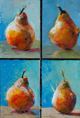
Pear Warm-Ups Letting Orange Show Through
In short, I start off with a warm tone to help me visualize and establish my darks and lights, my composition and my concept. Whatever color I use later, I allow the earlier colors to pop through - it gives my paintings a glow.
Next month, we'll finish the Warmups with giving them a WOW!.
Inspiration
A few years ago I remember reading an advertisement for Apple Computers, proclaiming that they produce products for us who think and see the world differently. The photos in the ad were of Picasso, Einstein and Ghandi, pioneers who have gone before us, created alternative points of view and made significant contributions to mankind. It got my attention! Below is the text from that ad which, I like to believe, speaks directly to us painters. Hang a copy of it in your studio. I dedicate this to all my Workshop Students!

To the Crazy Ones.
Here's to the crazy ones. The misfits. The rebels. The Troublemakers. The round pegs in the square holes. The ones who see things differently. They're not fond of rules. And they have no respect for the status quo.

You can praise them, disagree with them, quote them, disbelieve them, glorify them or vilify them. About the only thing you can't do is ignore them.
Because the change things. They invent. They imagine. They heal. They explore. They create. They inspire. They push the human race forward.

Maybe they have to be crazy. How else can you stare at an empty canvas and see a work of art? Or sit in silence and hear a song that's never been written? Or gaze at a red planet and see a laboratory on wheels?

We make tools for these kinds of people. While some see them as the crazy ones, we see genius. Because the people who are crazy enough to think they can change the world, are the ones who do.
Product Review
My Favorite Watercolor Paper

Bob with Fabriano Paper
Of course, I recommend Fabriano Watercolor Paper - I'm on the Board of American Advisors. Years ago I was struggling with other papers - they curled and buckled when I painted on them. When really wet, the paper emitted an unpleasant aroma. I think it smells like gym socks - it's the sizing from horses' hooves, okay?
So, at Fabriano, we removed THAT sizing and replaced it with something that resembles French flowers. The paper is not stiff and hard like other brands, yet it remains absolutely flat when wet. No matter how much I beat up my 300 lb. paper, it stays flat and flexible. Buy online at Blick store or Utrecht or the catalog of your choice. Blick has a really interesting discount right now and they carry all the Fabriano paper. Orders@dickblick.com Or call their ordering department - (800) 828-4548. They also have a special program for teachers and educators.

Fabriano Warmup Paintings
My all time favorite for fifteen years is Fabriano Artistico Extra White CP. It has two deckled edges. I love the history of this paper. It is still mould-made, using the slow rolled process. Hey, if it was good enough for DaVinci, it's good enough for me!
And back on the mainland, the other paper I love to trash around and it still holds together is Cheap Joe's Kilimanjaro Original Bright White Watercolor Paper. Order online at www.cheapjoes.com. I like these two papers mainly because I feel confident in their permanence, professional quality and toughness. That's what I like in a paper surface.
Useful Studio Tip from Bob
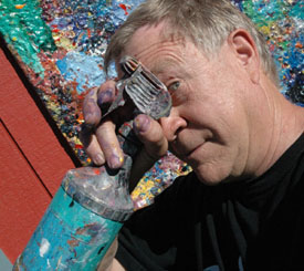
Still Life with Spray Bottle
Use an "industrial strength" pump spray bottle! You can buy them at hardware stores. I have noticed that some of you are using a mister in lieu of a spray bottle. Misters usually spray out too fine a mist to be effective. If you want a wetting-type of effect, then a fine mister will work for you. But if you want a larger spray area and heavier droplets, use an industrial strength pump bottle. I recycle empty spray bottles such as Windex, Shout, etc. Or I'll buy new spray bottles at Home-Improvement type stores - cleaning aisles. Get the type with adjustable nozzles.
In my studio I have two spray bottles: The blue one is for water. The red one is for Isopropyl Alcohol. Why alcohol? Tune in next month!
Music to Paint
(and Move!) By
As promised, here are several more CDs that I have on my iPod. Music is very important to me -- I always have music playing during my own studio time and during workshops. Why, at the May workshop in Colorado, Suzanne Jenne and Joy Schultz broke into a celebratory dance when the Dazz Band started playing!

Dancing with the Dazz Band
•The Best of the Dazz Band
The Millennium Collection
Audio CD (June 19, 2001)
Original Release Date: June 19, 2001
Number of Discs: 1
Label: Motown
ASIN: B00005KJR7
Buy at Amazon
•The Warm Chill
T. J. Rehmi
Audio CD (February 3, 2004)
Original Release Date: February 3, 2004
Number of Discs: 1
Label: Dharma Moon
ASIN: B00018D4EK
Buy at Amazon
•Buddha-Bar, Vol IV
Various Artists
Audio CD (April 6, 2007)
Original Release Date: February 12, 2002
Number of Discs: 2
Label: George V
ASIN: B000PHX56E
Buy at Amazon
For more music, click Click HERE and it will take you to my favorite Workshop Music -
We will post more favorites and new finds every month in our ArtsyFartsy News and on my website.
Update Info
Noel Marin of San Diego wrote to let me know that a book I had recommended earlier has been updated. "Art Class" has a 2005 version with newer info! Thanks Noel, good to know my readers keep me on my toes! We'll send you a Permission Mug!
And Julian Martinez, Kate's actor son (also a successful painter in Chicago) wrote us about a tidbit he learned in a book titled "The Actor and the Target" by Declan Donnellan, about "creativity or curiosity" --
"Renouncing Creativity seems hearsay to the artist. However it is unhelpful to try to be creative. Being consciously creative is closely related to concentration and "Me." Curiosity is more liberating; curiosity is connected to attention and the target. Trying to be creative has a nasty habit of sending us home. Of course all human beings are creative, but our creativity is a symptom and not a cause. We do not control our own creativity, any more than we can control our feelings. We can control what we do, and we can choose what we see."
...And I say, "if you're worried about doing a bad painting, you are already thinking about failure. Fear no Art!"

Bob in Front of Painting by William Loveless


Copyright ©2008 Robert Burridge. All rights reserved.
If you wish to copy this material to other publications or mail lists, please ask for permission by contacting:
Robert Burridge Studio
Arroyo Grande, California
805-459-1503
rburridge@robertburridge.com
www.robertburridge.com
Click HERE to sign up for the ArtsyFartsy News.
|
|
