Welcome back...
Welcome again to another issue of our free artist newsletter. It's folksy, newsy and well, artsy fartsy with helpful studio techniques. Of course it also promotes my products - shameless, but it works! Again, thank you for your comments. From what I've heard from you, this monthly pop-up on your computer screen encourages many of you to paint more works and helps with some specific paintings or marketing questions. I'm writing this flying somewhere over the White Sands Desert. I finished a great painterly week at Cloudcroft, New Mexico.
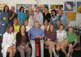
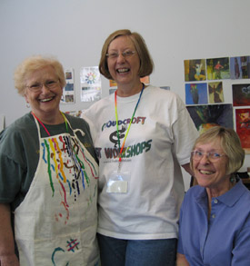
Cloudcroft Workshop Gang
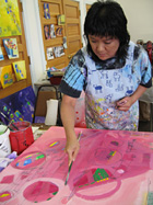
Anri Working
|
|
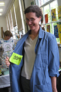
Flashing the Oops Slip!
|
Thank You Cloudcroft Organizers!
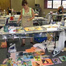
Cloudcroft Workshops were awarded the distinction as being New Mexico's Number One Workshop Destination for 2007. I was honored to have nineteen fabulous painters with me for an entire week. To round out the month of July, I am off to the Mendocino Art Center for another week of Loosen Up painting -- finally ending up at the Vermont Art Event for HK Holbein. A brief visit this month from my grandchildren makes this crazy schedule all worth it! That reminded me of an article I wrote many years ago for a Children's Art Workshop: "All Children are Natural Born Artists" --- because of summer, we will begin this article this month and conclude it in August. Read on! 
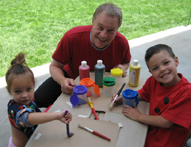
Bob and our Grandchildren
Product Spotlight
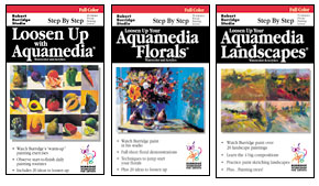
VHS Videos
Half Price Summer Clearance!
Three different videos - Three different subjects - All with my 20 Top Secrets
Loosen Up with Aquamedia Painting
Features my warmup exercises and how I use them to create larger works. 40 minutes.
Loosen Up your Aquamedia Florals
I paint on one 30"x40" canvas! 50 minutes.
Loosen Up your Aquamedia Landscapes
Includes warmup exercises, four landscape compositions and half-sheet ethereal landscapes. 53 minutes.
Each VHS Video $12.50 + CA sales tax (if applicable) + S/H
All Three VHS Videos $30.00 + CA sales tax (if applicable) + S/H
For info on ordering go to:
www.robertburridge.com/Products
Workshops in the Spotlight
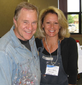
Bob and Jennifer Stone
Workshop in South Dakota
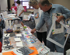
I couldn't let the month go by without mentioning the workshop Kate and I did in Watertown, South Dakota! Four days of Loosen Up painting and one day of Art Marketing - and they were STILL talking to us! The workshop was produced by Jennifer Stone. She brought together a group of some of the most professional and giving artists I have ever worked with. There were no whiners and they tolerated all of my bad jokes! (Well, most of them anyway...) The workshop location was at a technical college - BIG ROOM - everyone had their own table and a lot of space to spread out! You can view photos from this workshop and others by going to our website and clicking on Workshop Photos.
Sandy using all her Workshop Space
Different Mat Sizes Help in Cropping
If you are looking for a Burridge Workshop, it's not too late to register for "Loosen Up with Aquamedia Painting" at Dillman's Bay Resort & Creative Arts Foundation in beautiful Lac du Flambeau, Wisconsin - www.dillmans.com www.dillmans.com
Workshop dates are September 9-14, 2007.
More 2008 dates are listed on our website. Look for our annual workshops at the Palm Springs Art Museum, Mendocino Art Center and Sedona Arts Center. New locations include Yosemite, Santa Barbara, the Atelier in Chatsworth, California, Butte College in Chico, California, and Taos! You can access the Burridge Workshop Schedule by going to our
www.RobertBurridge.com
Recommended Book
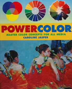
Powercolor Book Cover
Powercolor - Master Color Concepts for all Media
Many of you in my workshops have watched me point out examples in Caroline Jasper's colorful book "Powercolor." Caroline is an exceptional authority on color and her book features many examples of her teaching style and color theory philosophy. This is a must read reference book. Okay, okay she uses quite a few of my paintings to illustrate her book, but I must admit I learned more about color and mixing color from this book than any other! Powercolor � Master Color Concepts for all Media by Caroline Jasper. Watson-Guptill Publications.
ISBN 978-0823042609
Ask Kate about Art Marketing
|
ASK KATE! Every month, Kate will post your questions and her responses on the subject of marketing, sales, and promotion. If your question is selected for the newsletter, you will receive a Burridge Permission Mug. If you have a burning question that you would like to have answered -- for your benefit and everyone else's -- email Kate at kate@robertburridge.com
|
Cathy Peters from Ontario, Canada asks:
I'm considering setting up a website for my art works. Tell me please, as a marketing expert, what makes a good website? Lots of samples of pieces, bios, a good artist statement; perhaps just simplicity in a website?
Dear Cathy,
I love this question! As you can tell by looking at our website, I am an advocate of simplicity, speed and being straight forward in your presentation. If you are using a designer to help you assemble your website please convey to them that the most important thing is speed in accessing! If your website has too many bells and whistles (by this I mean, rotating & spinning things, busy backgrounds or heaven forbid, MUSIC, your potential customers will sit there while your site loads... and loads... you have to remember that not everyone has a hi-speed connection. I speak from experience: Our area is dial-up. If I have to sit for more than 30 seconds waiting, I'm gone!
So now that I've told you what NOT to do, here's what I recommend:
1. Images of your work that are a good representation of what you do. Organize them so your clients can navigate through different subjects or styles. Some artists use multiple gallery sections.
2. Resume - Include past exhibitions, commissions and awards.
3. Artist Statement - General statement can stand alone on its own page - you can also include your "Techniques and Materials." You can also include artist statements for your different gallery sections. For instance, with you Landscape Gallery, include an artist statement emphasizing that body of work.
4. Bio and photos of You!
Your website is a giant brochure! You can make it as complicated or as simple as you like - just make sure it is organized so your clients can find exactly what you want them to see!
Thanks for asking - Hope this helps!
Kate
Susan O. Gordon from Ukiah, California asks:
I have been asked to exhibit my work in a small gallery. I am an abstract,
nonrepresentational painter. My work is large ranging from 48x48 inch to
48x60 inch. For the show do I use one canvas size only? of course, It would be cheaper for me to use a small canvas. How do I determine the best size to paint on?
Dear Susan,
Your question about what sizes to offer the buying public, as well as put
on a great exhibit is a very good question. When we teach our one or two
day Art Marketing workshops, we talk about this very subject.
While having one size in an exhibit can be visually beautiful, look
"museum-like" and have a real pulled-together look, you can
inadvertently sabotage your potential sales. We advocate having a range
of sizes and therefore, a range of price points. We will have one big
show-stopper piece. It's usually the backbone of the show's theme AND
it's the invitation image. Larger sizes we have used: 48x60, 40x60,
42x62 inch... then we step down to 36x36 or 30x40 inch.... then 24x30 or 24x24 inch... I think you can see where I'm going with this. For an exhibit, we don't go smaller than a 16x20 inch. All pieces are either framed identically -- again, to give a uniform, consistent look overall. OR -- we use all museum wrap canvases.
We concentrate on the smaller sizes (36x36 inch and under) because our clients
are generally private citizens -- wall space seems to be getting smaller.
If we are showing to corporations, agents, art consultants or interior designers,
we tend to show the larger works -- think hotel lobby.
Thanks for asking -- hope this helps!
Kate
For more info, click HERE to check out our Hot Art Marketing Workbook.
Thanks for asking Kate!
"Kate - Your Art Marketing Girl!"
Click HERE for top of page.
|
|
 |
Our New ArtsyFartsy News Feature
We have an article archive index! We've received quite a few emails asking where is the Citra-Solv info or where is the gluing paper on canvas article... we listened to you!
To access the article archive, go to www.RobertBurridge.com and click on ArtsyFartsy News archives. You'll see the link in yellow, "ArtsyFartsy Article Archive." All of your favorites - The Inspiration, Book Reviews, Studio Tips, Compositions and Assignments are there. The index will be updated monthly so you can always find what you're looking for!
The Composition of the Month
Vertical Design - Number Five in featured series of Twelve. Your painting must be built on a strong foundation; i.e. a specific graphic design format, such as a cruciform design, asymmetrical design and so forth. The design for a painting is always one of the first things I determine before I start my work.
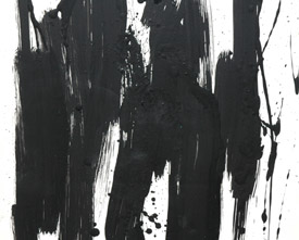
Vertical Black & White Loose Sketch Warmup
Black & White Vertical Composition
This month's feature is the Vertical design format. Pretty obvious. The main design thrust is up and down. You take it from there. Paint a few black and white 12x12 inch loose sketch warmups using an abstract vertical pattern. Keep it wet and loose like crazy -- use only Viva towels as your "paint brush." Also try using a water soluble drawing pencil. Need ideas to jump start you? Vertical trees... a vertical crowd of tall people... fence posts... a row of empty wine bottles... the list goes on and on!
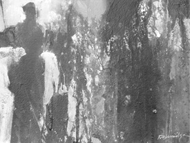
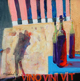
Finished Vertical Compositions:
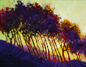
Vertical Trees
Everything is Vertical
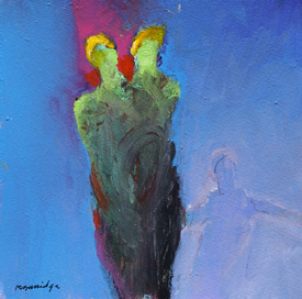
Vertical Abstract Figures
Studio Tip
Disposing of your Dirty Water - Panty Hose in a Bucket!
For those of you who live in an environmentally sensitive apartment or have questionable plumbing and/or sewage issues, getting rid of your "dirty water" from acrylic painting can be problematic. Also, workshops conducted in community centers, old buildings, school rooms, etc. have benefited from this great studio tip I learned from the San Diego Watercolor Society. You can dump your dirty water right down the drain if you do this:
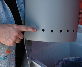
Bucket Showing Holes
1) Drill or cut holes around the bottom edge of a five gallon bucket.
2) Next, place a pair of old pantyhose (remember those?) inside the bucket and secure the waistline around the top edge.
3) Place the bucket inside a sink or outside on the ground.
4) Dump your dirty water into the bucket. The pantyhose acts as a filter and collects any debris. The filtered colored water pours out through the holes in the bottom. Of course, replace the pantyhose filter when it becomes too clogged or ineffective.
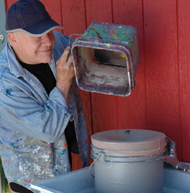
Pouring Dirty Water Through Pantyhose
It's not a perfect system or a grand solution, but it will work and keep the custodians off your back! As an added note, I use this system outside of my new studio. The grass and weeds are the greenest spots on my property - so there!
Product Review
Warmups on Cheap Joe's Canvas
Cheap Joe's Prime Canvas
I found the perfect warmup painting canvas! I was used to doing my daily warmups on 12x12 inch sheets of watercolor paper. I would do six warmups per day before venturing on to larger pieces. I wanted to paint my warmups on canvas, but felt the cost for canvas vs paper was a no-brainer. Then I discovered the Cheap Joe's Prime Canvas. As they say in government work, it's close enough and it works for me for my warmups. They are canvas, on stretcher bars and they ARE cheap - I love them!
All Children are Born Natural Artists.... and Painters
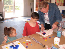
Bob Painting with Grandchildren
All children make the most amazing art! Picasso has often confessed that he borrowed freely from the creations of children and always had their artwork hanging in his studios! While I was a child, my parents had set up an "art table" for me and for each of my four brothers. My "creative arena" was always setup and ready for me to play, build things, break things, make things and create endlessly.
Art Making Table includes:
1) Large white paper pads suitable for paint (will not curl)
2) Large wide mouthed jars of primary colors, plus white and black
3) Large brushes - never small brushes
4) Large 1 gallon bucket of water
5) Use real art materials - shows our confidence that their work matters
Emphasize "Express Yourself":
•Young artists tend to paint what they feel is beautiful... often mandelas, saints in sacred places and shapes that have a center, such as a sun or the planet.
•This is the time to encourage painting wild and wacky colors, such as green sky, yellow grass and pink water, etc.
•Stress that this painting time is not an art lesson. Rather, emphasize they are here to be and act as artists (remember, children are already artists)
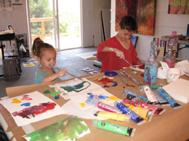
Aiden and Sophia Painting their New Masterpieces
Studio Painting Time
•Teacher/Artist to paint and demonstrate 10x10 inch warmup exercises and to utilize everything in front of them... paint, tissue paper, pencils, glue, string, etc.
•Then introduce a subject such as a bird. Have the children discuss and give their impression of what a bird does and is. Not how to draw a bird... but instead, your interpretation of a bird. Make it fun!
•Show painting reproductions of Miró, Klee, Kandinski, late-period Picasso and late-period Matisse (the Jazz series).
...To be continued in the August Artsyfartsy News!
The "Sometimes Fear" in Painting
You are afraid because you are thinking about the end result, not about what you are doing.
Don't try to be perfect. It puts too much pressure on you. Think of each layer as never being finished... but instead, waiting for the next phase.
The amateur painter is afraid of boldness - the professional is afraid of timidity.
Too many painters patiently render, rather than create. Do not paint a picture. Instead, create a work of art... Your Art!
Bob-ism of the Month!
Think about this...
Vision without action is day dreaming.
Action without vision is a nightmare!
Vision with action is a painting worth doing.
Bob Caught Daydreaming in his Studio


Copyright ©2007 Robert Burridge. All rights reserved.
If you wish to copy this material to other publications or mail lists, please ask for permission by contacting:
Robert Burridge Studio
Arroyo Grande, California
805-459-1503
rburridge@robertburridge.com
www.robertburridge.com
Click HERE to sign up for the ArtsyFartsy News.
|
|